
For many pyrography artists, the beauty of the craft lies in the contrast between dark burn lines and natural wood. And in some instances, some pyrographers don’t understand why someone would add color.
Sometimes a little color can elevate a piece in surprising ways. The key is knowing how to add color without overwhelming the burn itself.
When Color Works Best
Color works best when it supports the design rather than becoming the focus.
In most pyrography pieces, the burned lines carry the structure of the image. The shading, textures, and outlines are created with heat. Color simply adds atmosphere.
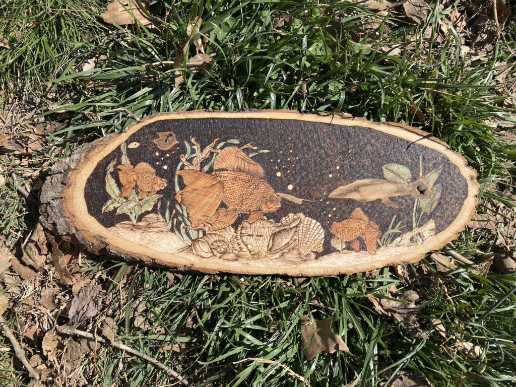
A soft blue wash in a sky or a gentle green tint in leaves can bring a piece to life without overpowering the wood.
Watercolor
Watercolor is one of the most commonly used media for colored pyrography.
It’s transparent, easy to control, and allows the burn marks to remain visible underneath the paint.
Light washes work best. Heavy paint layers can hide the subtle textures created by the burner.
Colored Pencils
Colored pencils are another excellent option because they allow for precise control.
They work particularly well on detailed pieces where small areas of color are needed. Leaves, eyes, feathers, and small decorative details can all benefit from the subtle layering that pencils allow.
Acrylic Washes
Acrylic paint can also be used, but it needs to be diluted heavily.
Thick acrylic paint tends to sit on top of the wood rather than soaking in. When diluted with water, it behaves more like a stain and blends better with the burn work.
Less Is Usually More
One of the most common mistakes beginners make with color is using too much of it.
The burn should remain the dominant element of the piece. Color is simply an accent.
When used sparingly, it enhances the artwork without competing with the texture and warmth of the wood.

