
If you’ve ever finished a piece and thought, Something feels wrong, but I can’t explain why, this lesson is for you.
It’s rarely the burning.
It’s usually balance.
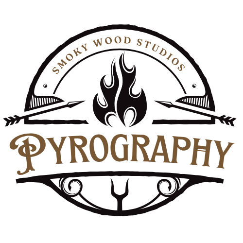
Symmetry vs balance (they are not the same)
Symmetry is mirroring.
Balance is visual weight.
You can have:
- symmetrical but boring designs
- asymmetrical but balanced designs
Beginners often chase symmetry because it feels safer, and that’s okay.
Why symmetry builds confidence early on
Symmetry:
- gives you clear reference points
- reduces decision-making
- exposes spacing issues quickly
Folded-paper thinking helps here. If one side works, the other side already knows what to do.
Balance: the quieter skill
Balance asks different questions:
- Where does the eye land first?
- What feels heavy?
- What feels crowded?
Dark burns weigh more visually. Dense areas feel heavier than open ones.
Balance is why negative space matters.
Simple fixes when designs feel “off”
Before you scrap a piece:
- add space instead of detail
- darken a lighter area instead of fixing the dark one
- repeat a motif elsewhere to echo it
Most imbalance comes from overworking one area.
Ask me how I know.
The confidence piece (because it matters)
I still second-guess my designs. The difference now is that I know what to adjust instead of assuming I’m bad at this.
Symmetry and balance give you language for that doubt, and language gives you control.

